Redesigning a Book Cover: The Outsiders
In this case study we’ll cover the creative process I took to redesign the book cover of The Outsiders by S.E. Hinton
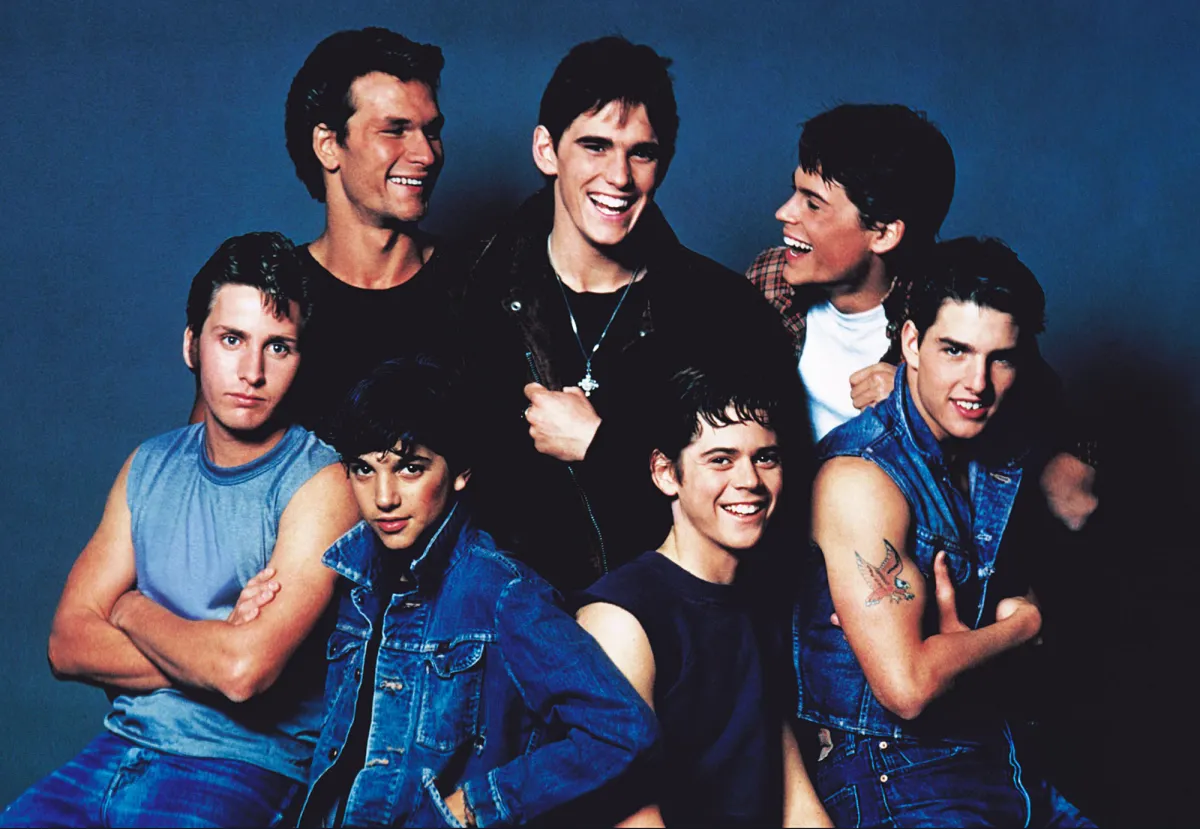
The First Stage: Ideation | Everything I’ve ever known about the book
At this point in the process I decided that I wanted the book The Outsiders to be the cover that I revamped for my project. In order to push myself creatively I came up with a list of words that I thought could inspire more interesting ideas rather than just illustrating a scene in the book.
Sunset
Gold
Fire
Switchblade
Mustang
Leather
Church
Cigar
Blood
Movie
Hair
Grease
Fountain
Night
Stars
Jacket
Gritty
Rebel
Misunderstood
Emotional
Loyal
Brave
Hurt
Lonely
Bold
Tough
Gentle
Regretfull
Disenchanted
Tired
Innocence
Neccessity
Brothers
Orphan
Gang
Belonging
Dramatic
Runaway
outcast
survival
rough
Magazine
Brotherhood
Judge
Violent
Grief
Hope
Redemption
Hero
Class
Fear
Change
Evolve
Learn
Empathy
Loss
Desire
Sacrifice
Cherry
Soda
Escape
Struggle
Betrayal
Preliminary Mood Boards: What are we thinking? How are we feeling?
Now that I knew the general ideas I found interesting in the book, I wanted to give myself a mood board to look at to get a good idea of the visual vibe of the book. I steered away from describing people or places too clearly, I wanted to keep it very open.
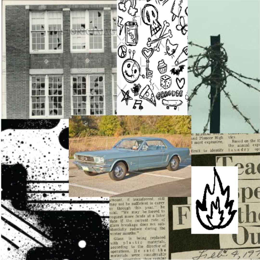
Thumbnails: What Best Represents The Outsiders?
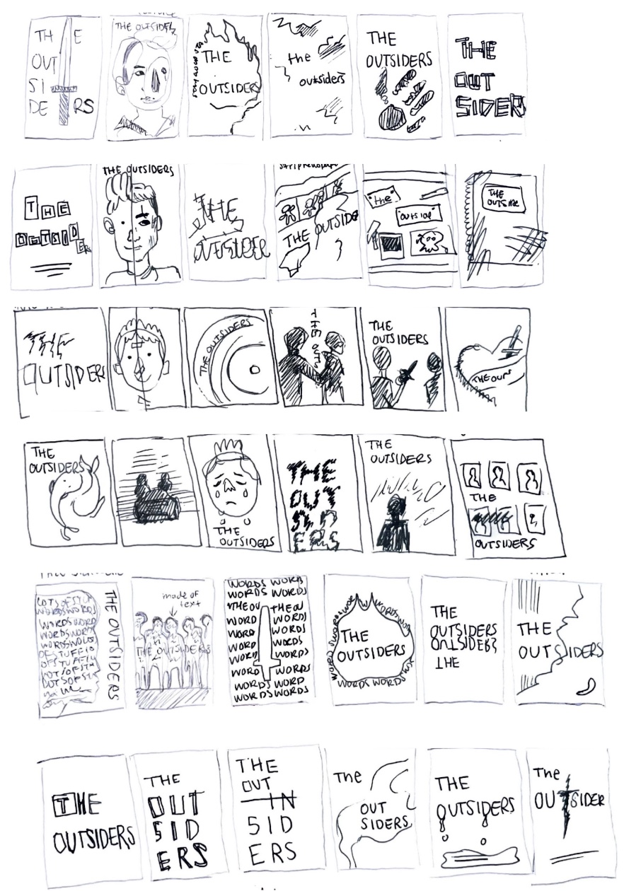
This was the first time I ever sketched anything for the project. I tried to differentiate as much as possible and keep my options open. I decided to create a total of 30 thumbnail this first round and made sure that I stayed diverse in genre and gave attention to more visual and more text focused covers.
Primary Sketching: Where are we going?
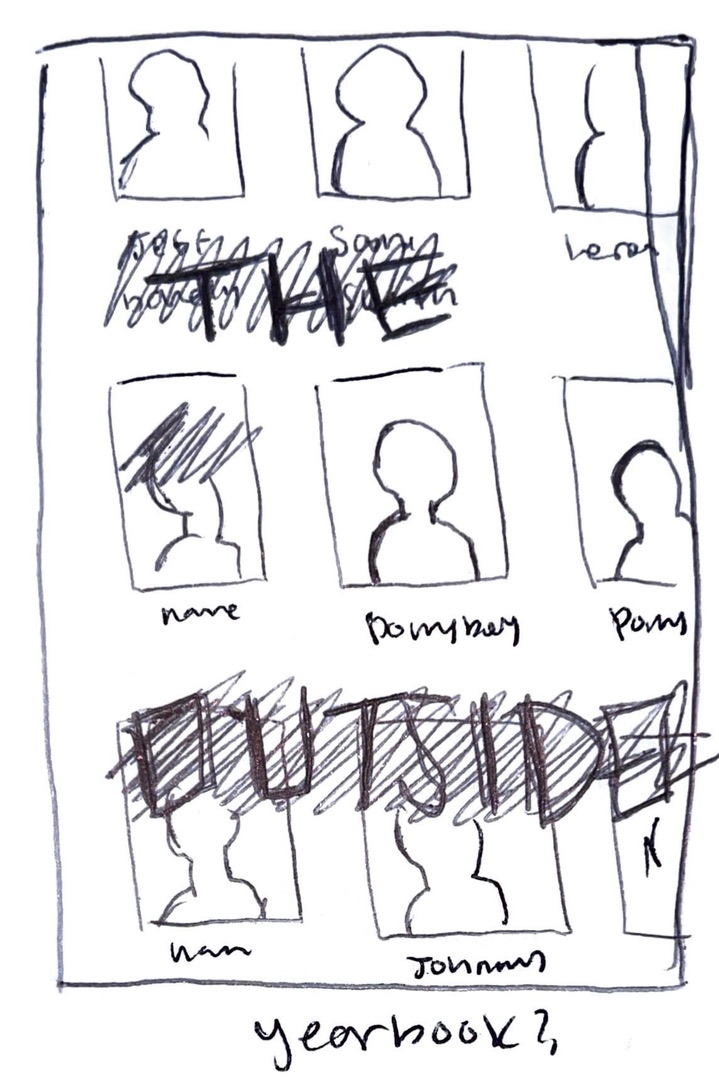
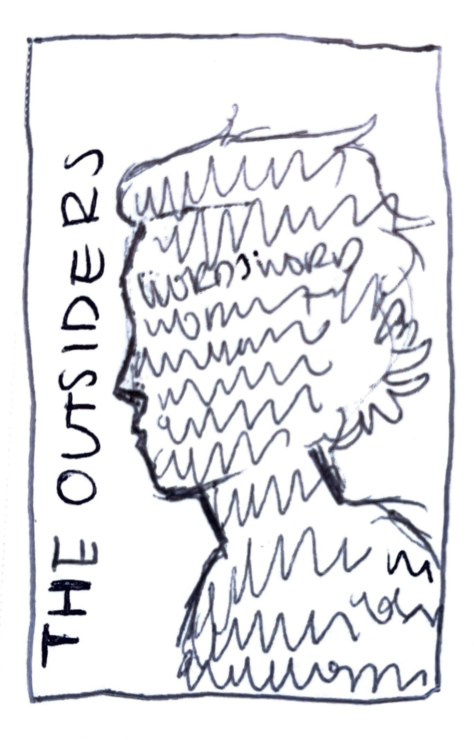
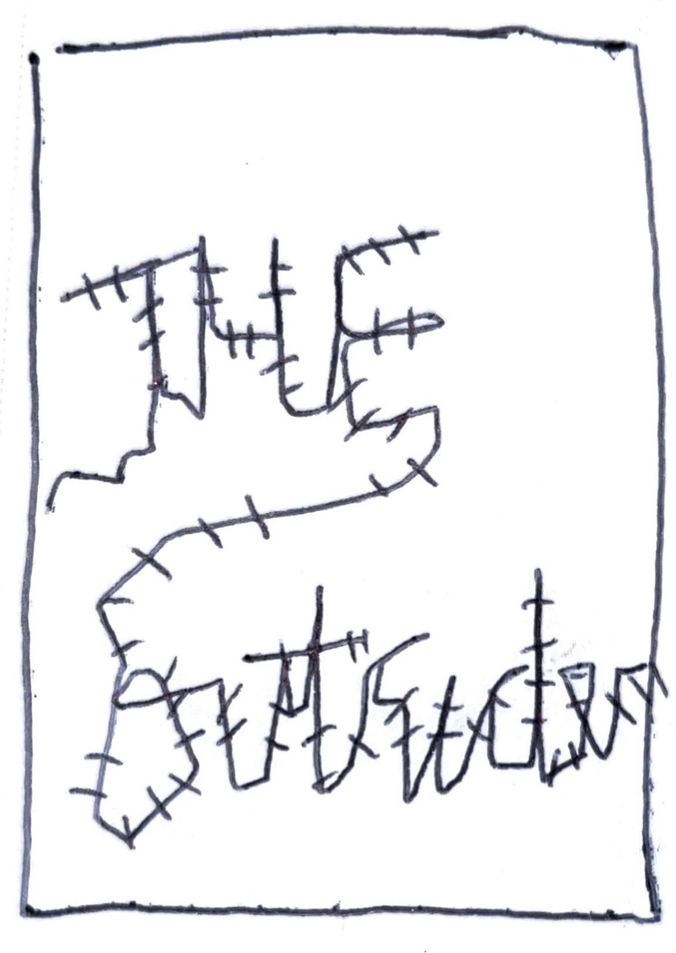
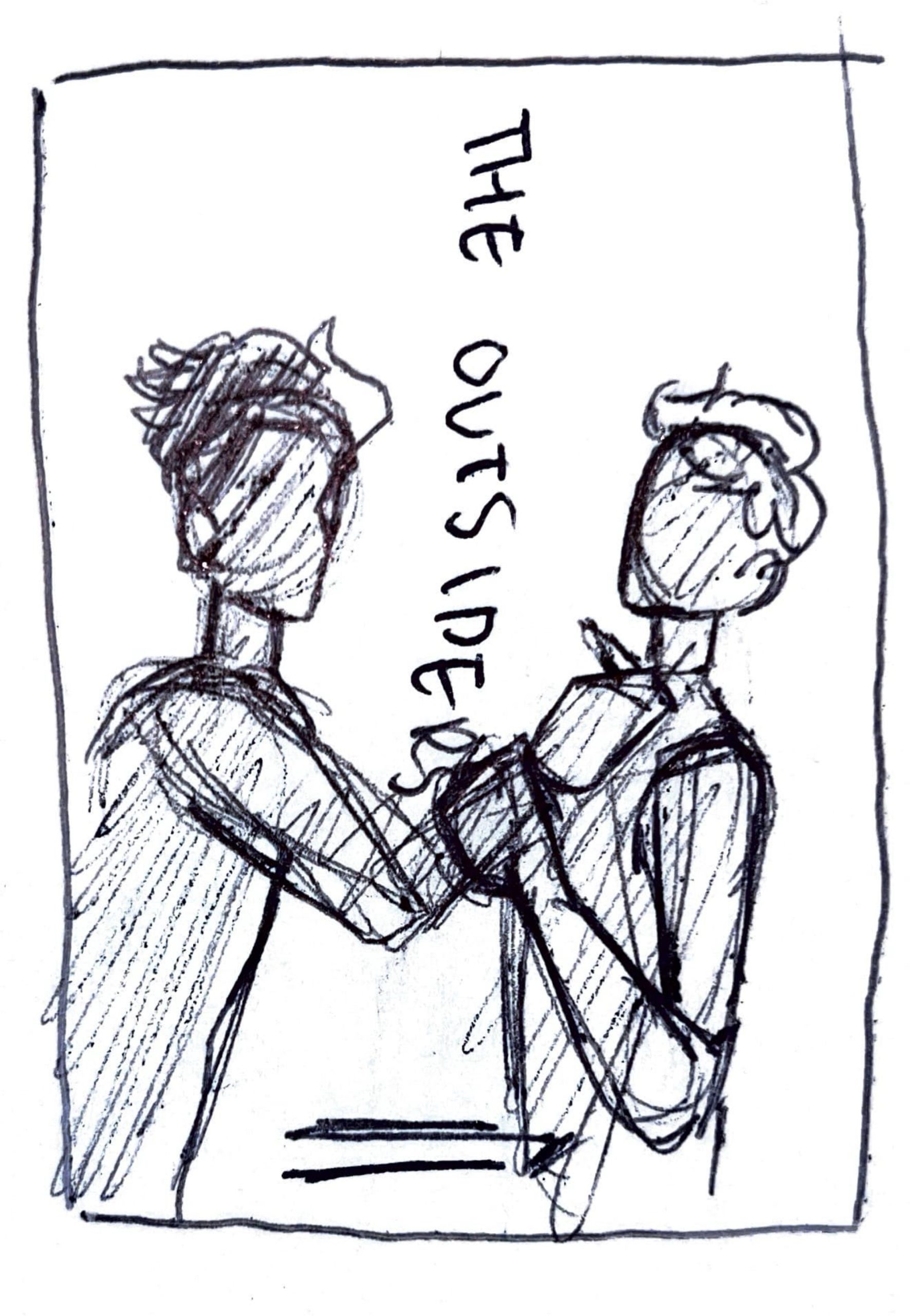
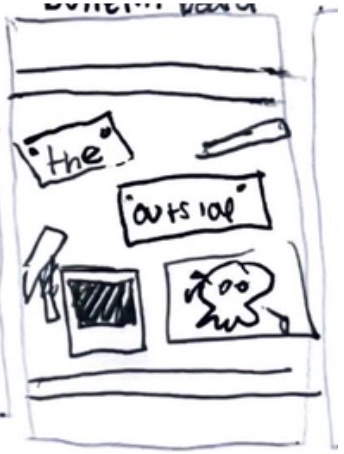
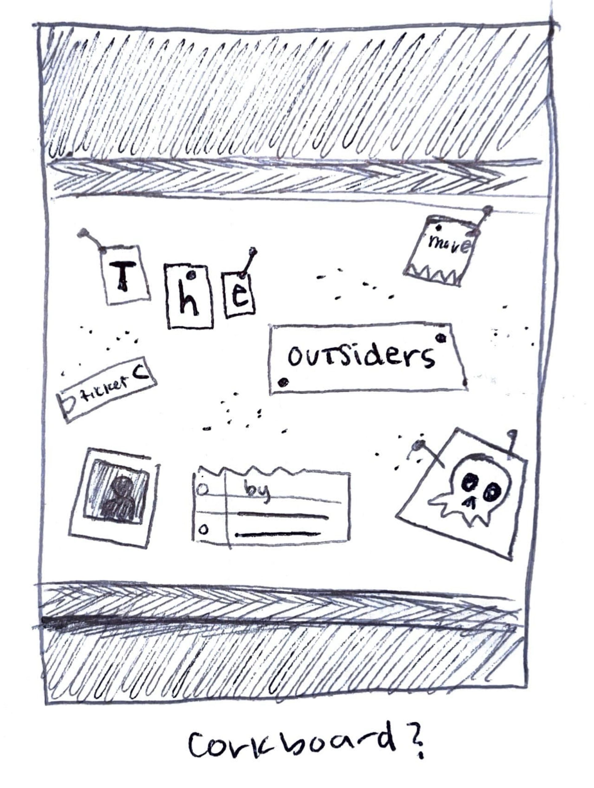
I took my best ideas from my initial thumbnails and I refined them further. This meant cleaning up lines and working on compositions more. I really started to flesh out here the general ideas I liked which was loss of youth, contention, and being forgotten. You can see the way that the visuals evolved from draft to draft.
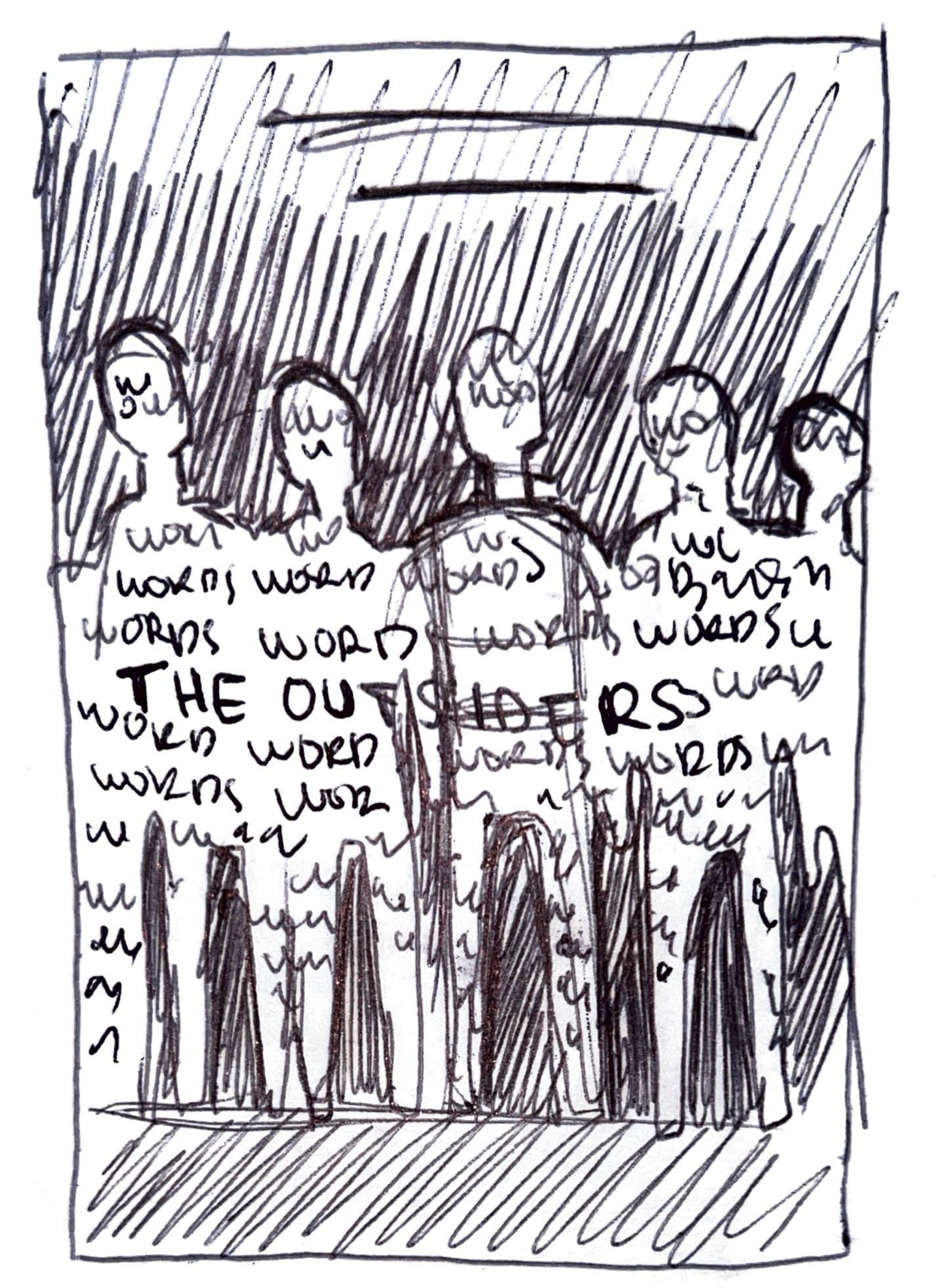
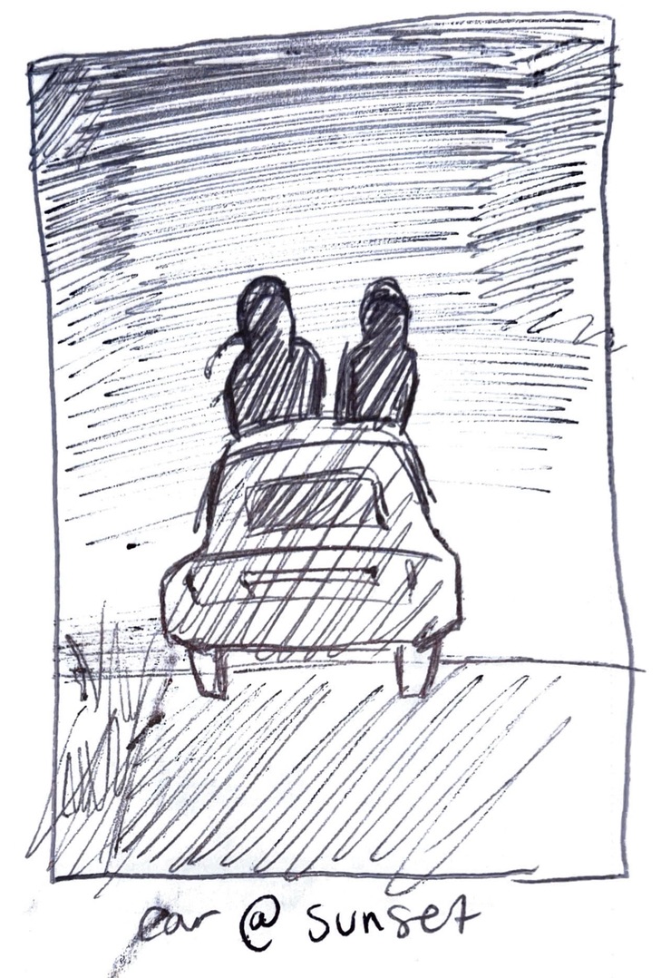
First Drafts, Not too Shabby: is what I would say if these were good
I didn’t stay super consistent with refining the same visuals that came from the previous stage of drafting, but I did find a lot of visuals that really caught my eye. From here you can see where I didn’t take some of them to the next step of the process, just because I really couldn’t see them as a cover, more as a poster.
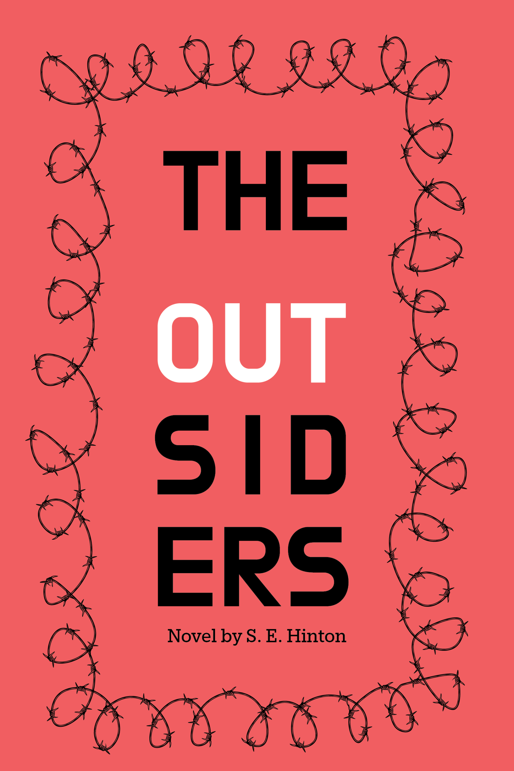
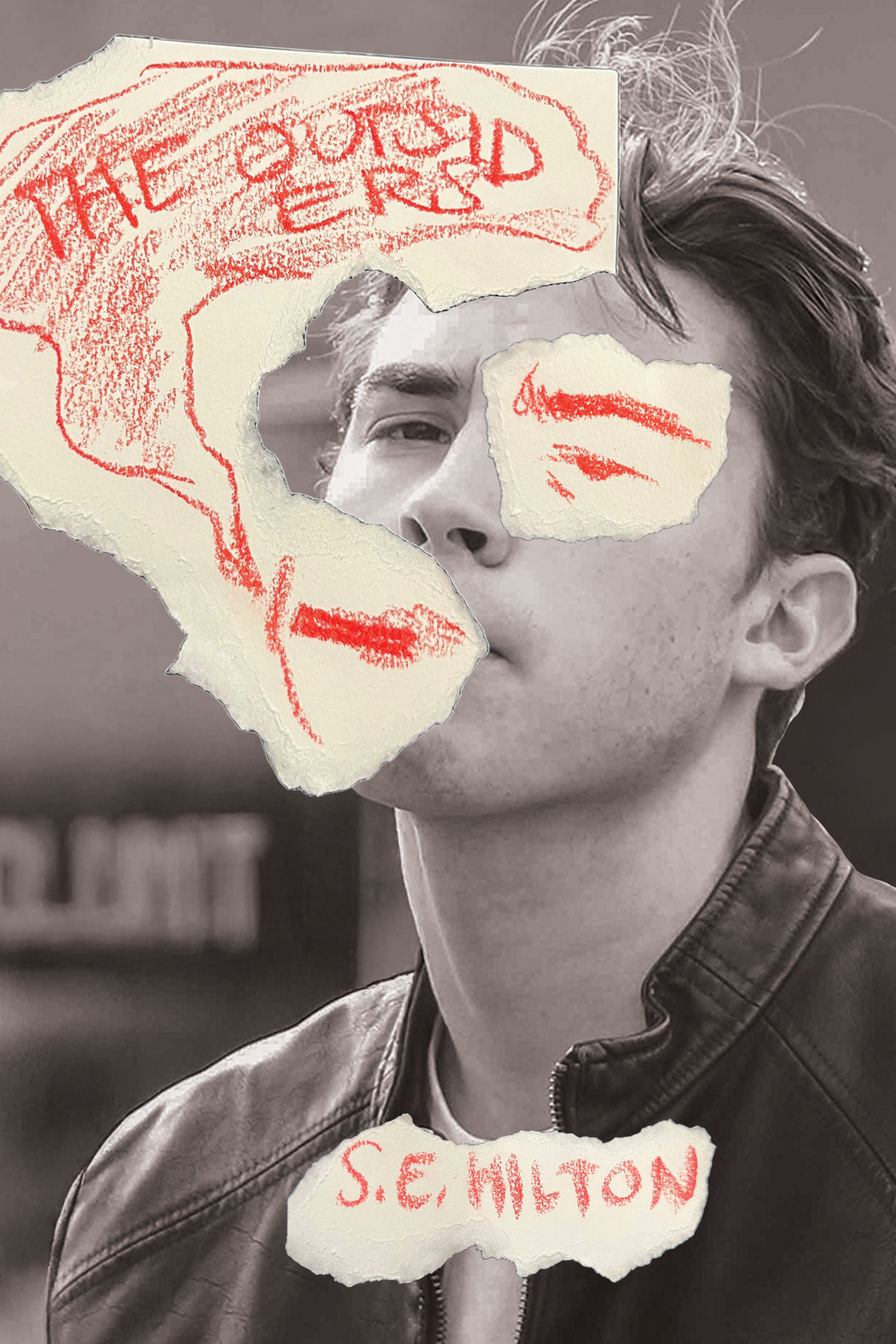
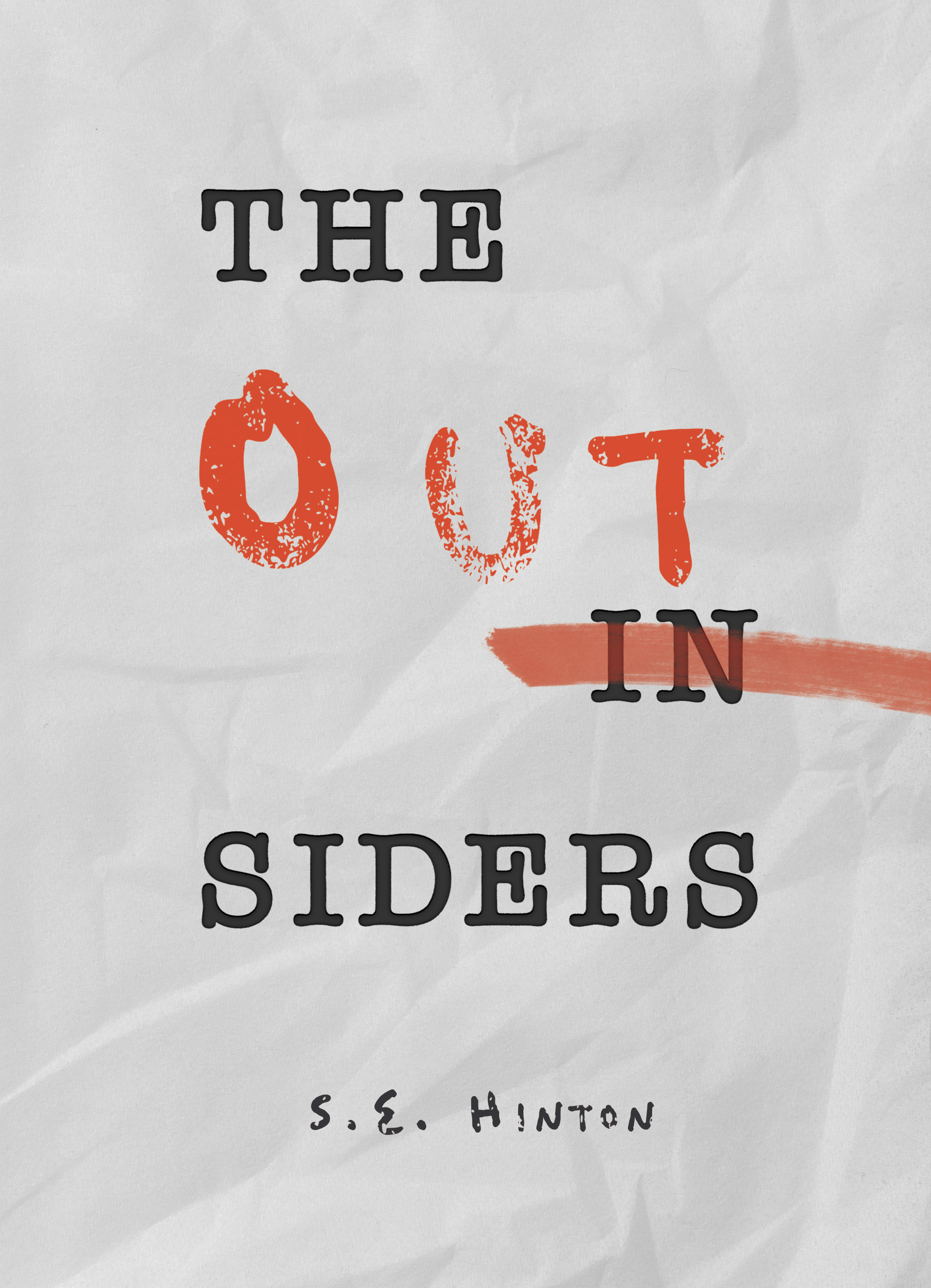
Second Drafts: it's all uphill from here
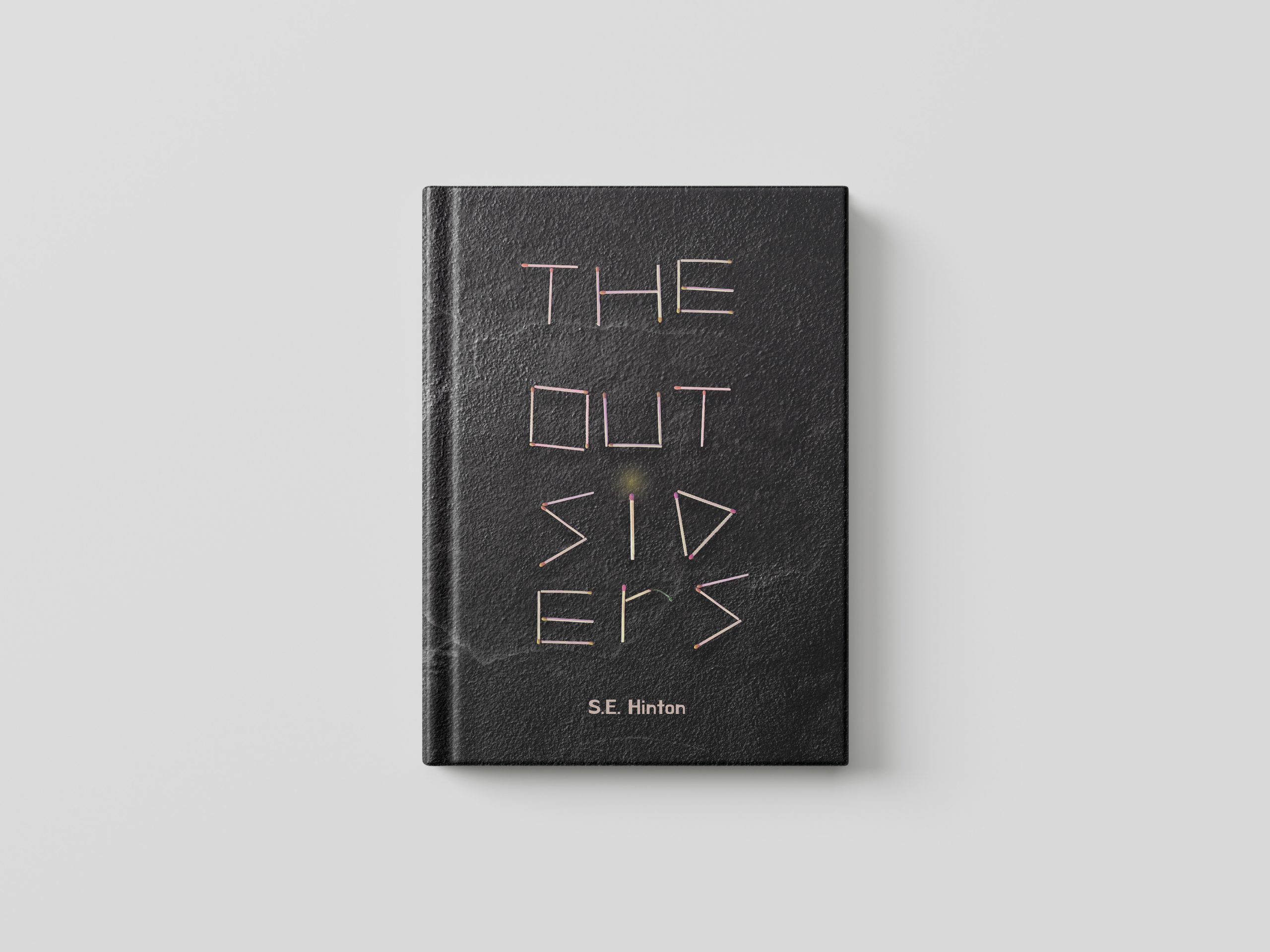
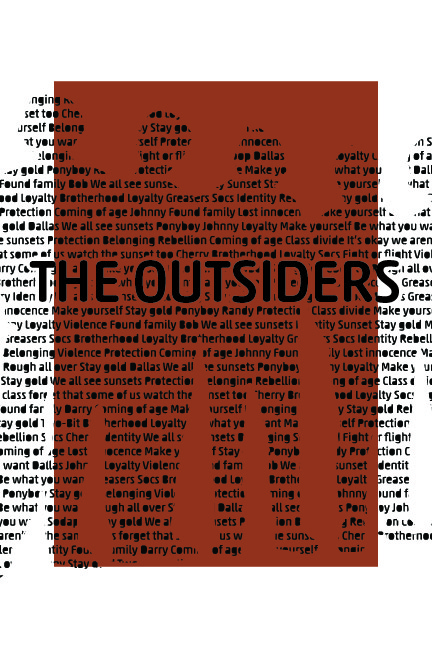
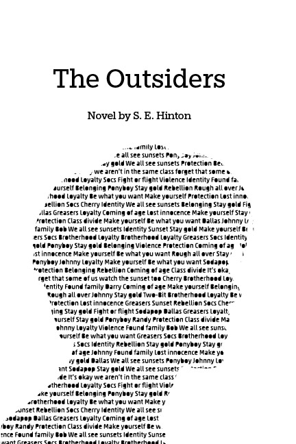
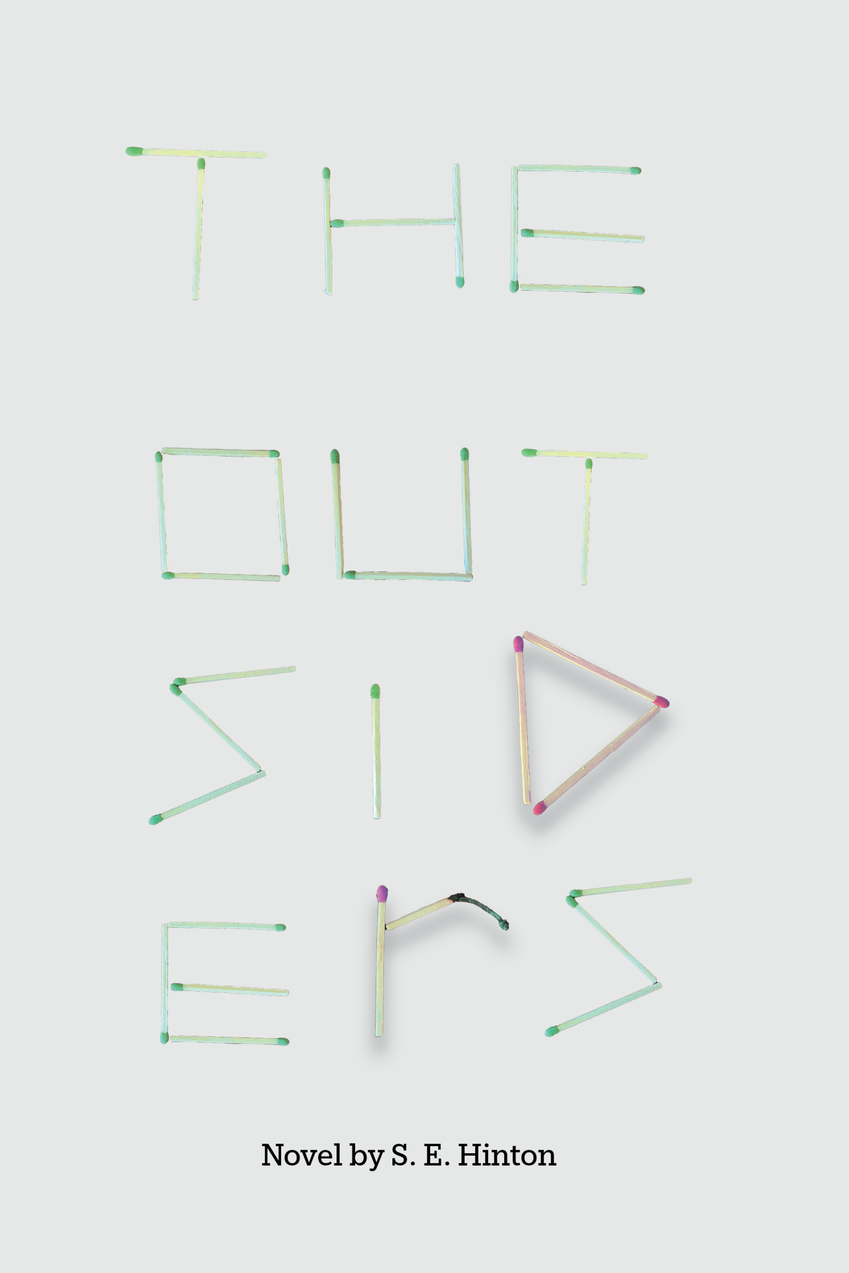
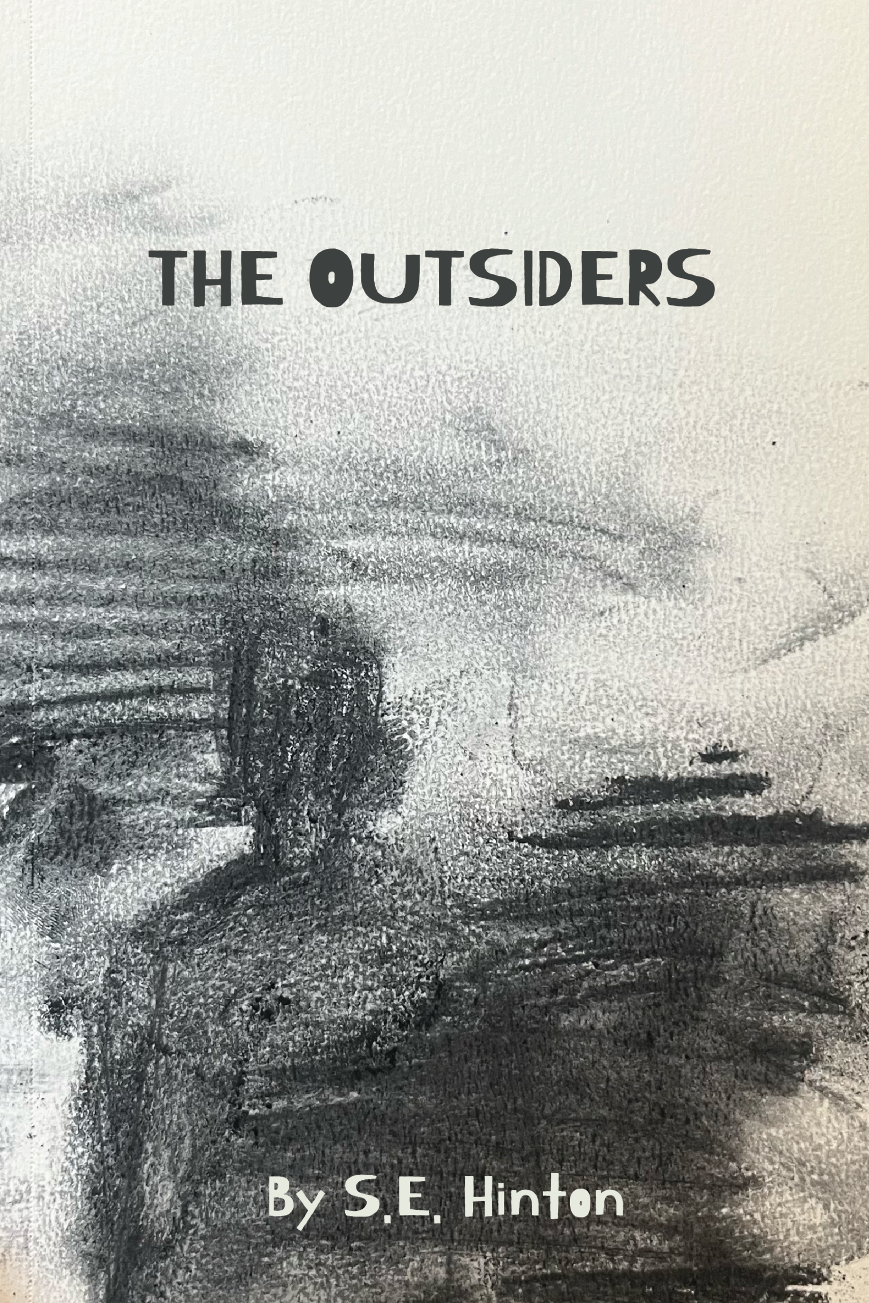
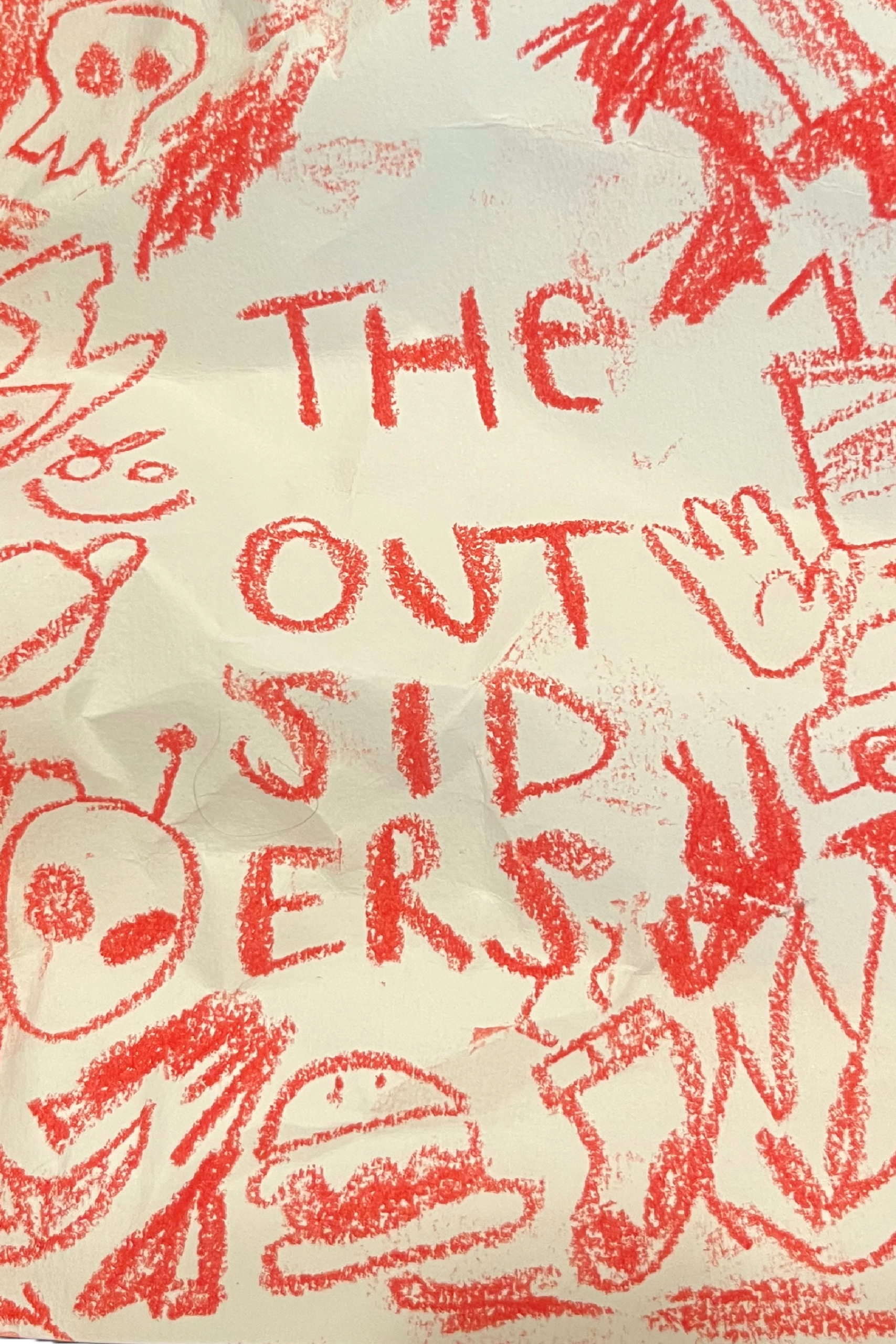
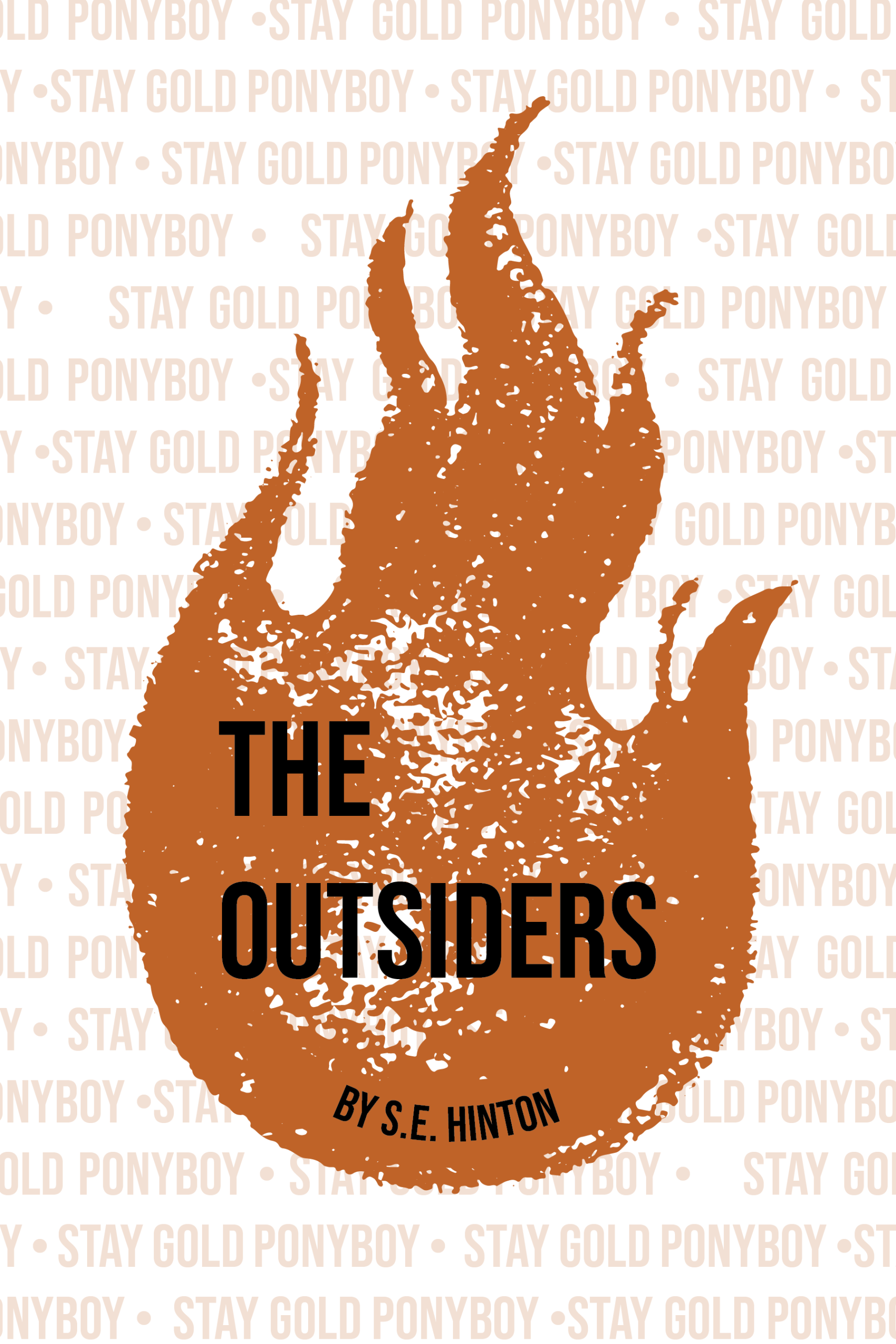
I moved to the next stage of the drafts where I made great strides in the right direction with really working on the overall quality of the posters. I made sure to change the saturation and contrast of the matches
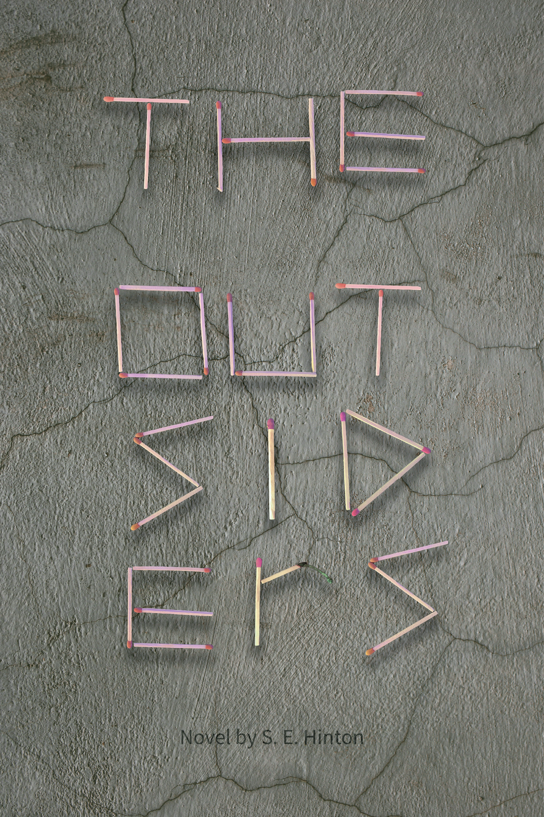
The Mona Lisa: just kidding it's the book covers
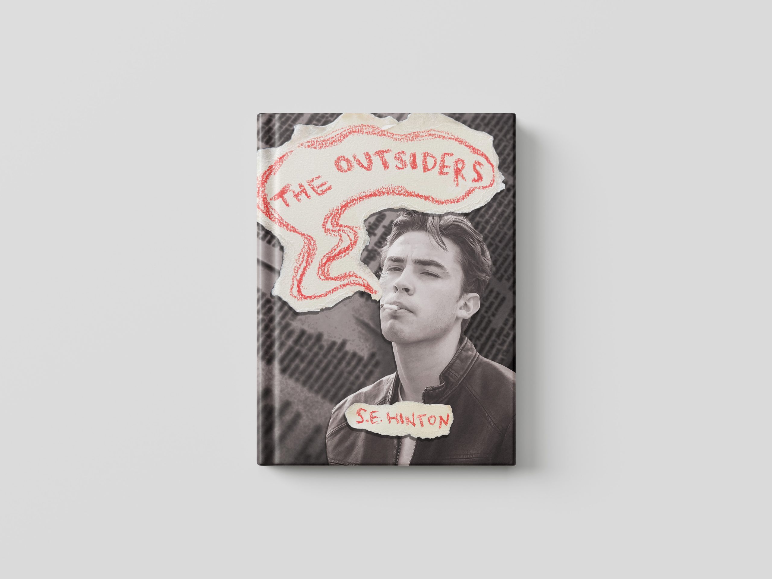
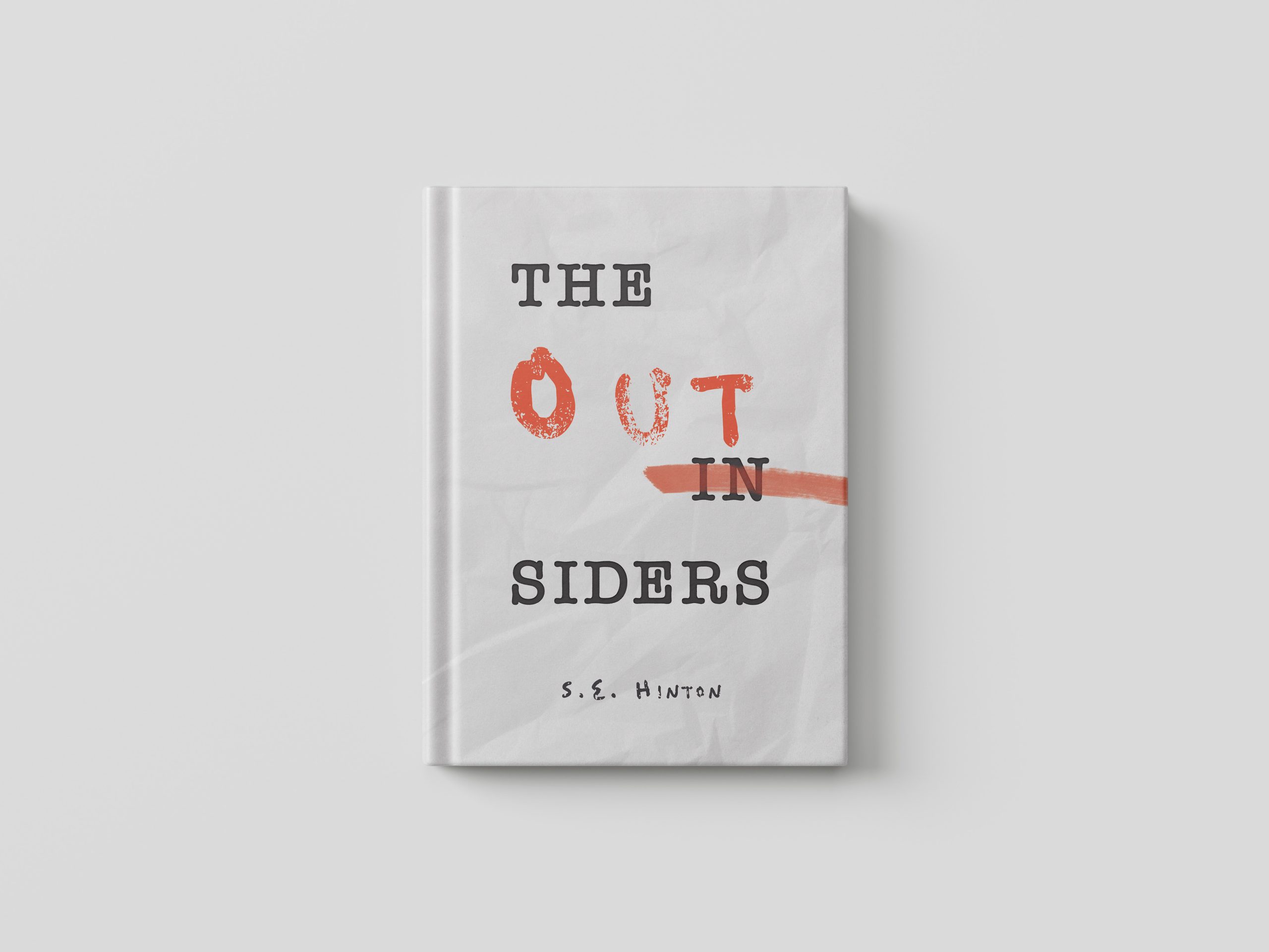
Here are the final book covers! I put them into mockups to better invision them as books. They went through one last stage of editing before this.
